Further, data on the discharge of the Rhine must be input, due to the discharge largely determining the speed in which the pollution is carried downstream.
The model then calculates how the pollution moves downstream in the river. This can take place in various ways. The model can display the pollution on a map of the Rhine basin, for example (see below).
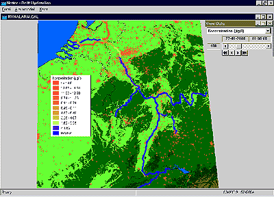
The red color of the IJssel and Waal rivers on this map means that there was strong pollution present at the time of display. The blue color of the Lower Rhine and Lek indicates that there is no pollution here as yet. This is due to the slow flow of these rivers, caused by the weirs built here.
In Germany, the Rhine is polluted downstream (yellow color) but the river is clean again (blue) further to the south.
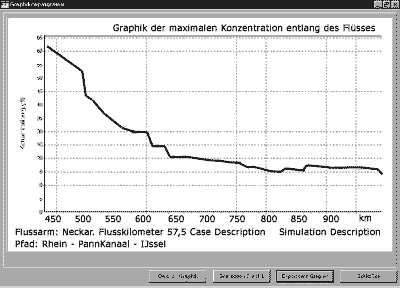
Exact data on the pollution can be displayed in graphs or tables, e.g. the maximum pollution occurring along a chosen stretch of the Rhine as the wave of pollution flows through. The graph below shows this data for the stretch from mouth of the Neckar to mouth of the IJssel.
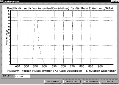
Another option is to display the progress of the pollution on the basis of time at a chosen location, either as a graph or table. This has been done below for flow km. 942.4 along the IJssel. One can conclude that the wave of pollution arrives here 525 hours after the discharge of the harmful substance in the Neckar, and which concentrations appear.
An example of a fictitious discharge of harmful substances in the Neckar is shown here as an illustration of the working of the Rhine Alarm model.
The following features will be put in: the location of discharge, the time and duration of discharge, the amount of harmful substances and the biodegradation percentage of the harmful substance discharged. It is also indicated whether it is a floating harmful substance (such as oil) or a substance which mixes with the river water.